


At Persistence One, we believe that change is the driving force of innovation. As our journey has evolved from our origins in the Cosmos ecosystem to our renewed focus on seamless cross-chain Bitcoin interoperability solutions, our brand needed to evolve too.
In alignment with our new direction and deepening focus on Building for Bitcoin, we decided it was time to refresh the Persistence logo. But we didn’t do it alone—we turned to our community for input to ensure the new logo truly reflects our shared vision.
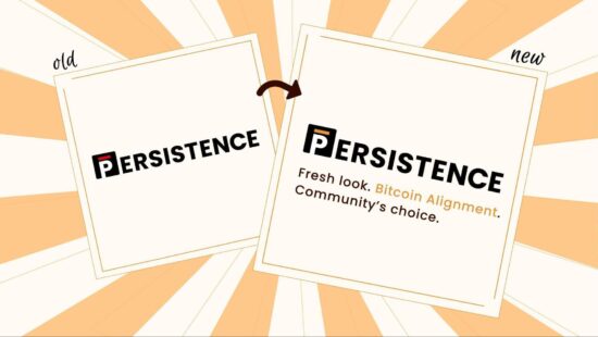
We are thrilled to unveil the latest chapter in our story with the reveal of our refreshed logo.
Fresh Look. Bitcoin Alignment. Community’s Choice.
Our new logo is not just a symbol —it represents our unwavering commitment to align with Bitcoin, explore new horizons, and establish Persistence One as a premier venue for swapping BTC and other related assets across Bitcoin Layer 2s.

Creating the new design for the refreshed logo was an engaging and collaborative process. We immersed ourselves in multiple iterations and brainstorming sessions to ensure the logo perfectly encapsulated our new mission and vision.
However, we firmly believe that the heart of our brand lies within our community, which is why we placed the final decision in their hands.
Through active participation and discussion on X, we invited the Persisters to share their thoughts and ideas on the new Persistence One logo.
We were thrilled by the enthusiastic response and deeply appreciate the community’s participation. Among the five options, the original Persistence One logo, with a slight tweak, emerged as the favourite. This choice resonates with our legacy while also reflecting our laser focus moving forward: Building for Bitcoin. The strong community preference for the original design reaffirms the solidity of Persistence One’s branding and its enduring resonance with our community.
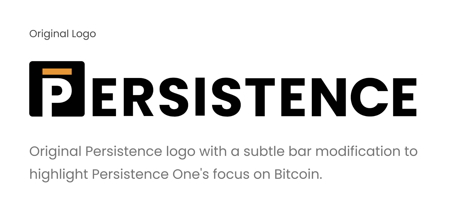
Logo Explanation
Bar Notation: Symbolizes the team’s perpetually persistent efforts.
P in the Box: Reflects working within restricted spaces while pushing boundaries.
P Extending Beyond the Bottom Edge: Demonstrates Persistence as the bridge to an open world with infinite possibilities.
Black and White: Chosen for the brand logo to signify timelessness and durability.
Orange: Represents our alignment with Bitcoin and marks the beginning of our new journey.
As we enter this new chapter, we invite you to celebrate our refreshed identity. The core values of Persistence One—Integrity, Humility, Patience, and Persistence—align seamlessly with those of Bitcoin itself. We’re excited to move forward on this new journey together!
About Persistence One
Persistence One is building a Bitcoin interoperability solution to enable cross-chain BTC swaps across Bitcoin Layer 2s.
The rapid rollout of Bitcoin L2s and side chains has led to fragmentation, hurting BTCfi scalability. Using the power of intents, Persistence One will enable users to move assets across Bitcoin Layer 2s more efficiently than traditional bridging, offering fast, secure, zero-slippage cross-chain swaps.
Twitter | LinkedIn | Telegram | YouTube | Reddit | [email protected]